Montwave is specialized in design and manufacture of domestic bontique coffee widgets. We continue to explore the balance between high performance and ease of use of such widgets on different scenarios from a perspective of product underlying logic and structural shape.
We insist on the philosophy of “rationality, rigor and wealthiness of humanity” to create products which can generate a emotional connection in the long-term use by the users with high standard and diversified materials and production processes.
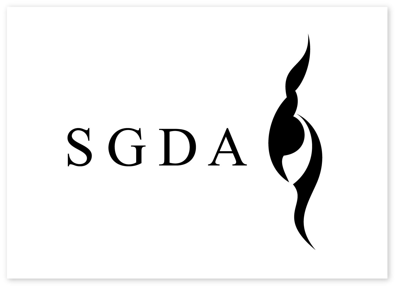
Montwave means continuous mountain trends. It seems like the process of cooking coffee and this is a living art about stabilit and flowing.
We undertakes the branding design of the logo, product package, printed matter and E-commerce platform identity system setup. A power of rational pragmatism and perceptual humanity temperature connection is injected into brand new visual identity design laid out in the global coffee widget segment.
In the development of branding design strategy, our goal is not only to enable the brand to take an image of vision memory but also to hope to establish a visual identity system which attach importance to changeability, unified continuation and practical functionality.
Emotional connection rich in humanity seems like the flowing of mountains. It together evolves as the identity system with the high standard stability brought by excellence technique. It is the important brand visual identity asset of Montwave.
Based on the nature of “stability and flowing”, we refine it as a visual language of “continuous wave trend”. Additionally, the upper and lower areas of the layout are divided functionally as the logic of grid setup in the conceptual form of “horizon” so as to derive a diversified grid system varying with layout contents.
The symbol of Montwave is labelled as an extremely simple, stable and organic polygon group. It is shaped like a mountain. Its integral shape is like a unique “m” to work in concert with the first letter “m” of the brand name “Montwave”.
The arrangement of the brand logo is highly distinctive. Based on the visual langauge of wave, it is embedded into the grid system set up based on the logic of the form of "horizon". Therefore, a continuous mountain trend is derived so as to enable consumers to sufficiently experience the richness and diversification of the brand value while improving the brand memory.
The wave trend of the logo is embodied in the overall visual identity system. Its shape and position vary with contents in the specification. This makes the visual system possible to exhibit humanity emotion under the logic of rationality. We can understand this as: this is the emotional connection between rational pragmatism and sense humanity temperature.